Wednesday, March 28, 2012
Triangle Plot
http://www.dplot.com/triangle-plot.htm
Triangle plots are a graph or map that represents three variables. Most triangle plots are seen in chemistry and mineralogy. The graph above shows three variables; sand, clay, and slit. The graph also shows the composition of the soil by comparing the level of each part within the soil.
Windrose
http://www.mathworks.com/matlabcentral/fileexchange/17748-windrose
Windroses are tools that meteorologist use to show wind speed and direction in a given area. The map above show the majority of the wind coming out of the South Southwest at 20-25 mph or knots.
Climograph
http://akinspreapbiology.pbworks.com/w/page/30857009/Nutall%208th%20period%20Glaveston%20Wetland
Climographs are maps in graphical form that show monthly precipitation and temperature for specific areas. The map above shows both rainfall and temperature for Corpus Cristi, Texas. August, September, and October depict the highest rate of rainfall. June and July depict the highest temperatures.
Sunday, March 25, 2012
Population Profile
http://2010.census.gov/2010census/
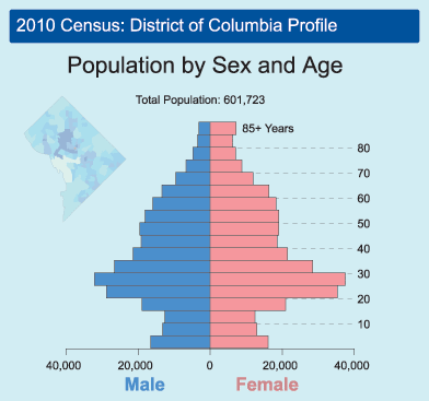
According to dictionary.com, a Population profile is a "a chart showing the number of people as a function of their age." A Population Profile is simply a chart that visually shows the number of people and their specific ages in a given area. The chart or map above features population by sex and age in District of Columbia in 2010.
Source: http://dictionary.reference.com/browse/population+profile
Scatterplot
http://rortybomb.wordpress.com/2011/04/11/housing-lock-is-not-a-major-component-of-this-crisis-plus-scatterplots-of-deleveraging/
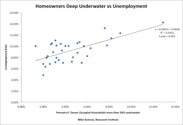
A scatterplot is a way to show a relationship between two variables. The map above represents the relationship between households more than 50% underwater and unemployment rate.
Nominal Area Choropleth Map
http://politicalmaps.org/2008-house-of-representatives-election-maps/
Nominal Area Choropleth Map are maps that shows categorical data rather than numerical data. The elements of a choropleth map are used within these maps to separate the data being shown. The map above shows U.S House winners by district during the 2008 Election.
Accumulative Line Graph / Lorenz Curve
http://www.mathworks.com/matlabcentral/fileexchange/19968
According to Wikipedia, "In economics, the Lorenz curve is a graphical representation of the cumulative distribution function of the empirical probability distribution of wealth; it is a graph showing the proportion of the distribution assumed by the bottom y% of the values. It is often used to represent income distribution, where it shows for the bottom x% of households, what percentage y% of the total income they have." The graph above features the percentage of the population from the poorer to the richer comparing the wealth. The blue line (Lorenz Curve) represents income distribution.
Source Wikipedia & Sullivan, arthur; Steven M. Sheffrin (2003). Economics: Principles in action. Upper Saddle River, New Jersey 07458: Pearson Prentice Hall. pp. 349. ISBN 0-13-063085-3.
Subscribe to:
Posts (Atom)


