Thursday, March 29, 2012
Histogram
http://wattsupwiththat.com/2008/02/28/a-look-at-4-globaltemperature-anomalies/
Histograms are graphs or charts that show data in a visual presentation. A histogram incorporates the use of vertical bars to show a comparison between two variables. In the chart above, it shows a comparison between cool and warm temperatures.
Wednesday, March 28, 2012
Parallel Coordinate Graph
http://vis.lbl.gov/Vignettes/Drosophila/index.html
Parallel Coordinate Graph are graphs that are used to show analyzed statistical variables in one graph. The graph above show a relationsgip between all cells and nine selected genes within the body. The graph is in 3D and shows the different genes and its location within the embryo. As one can see, certain genes are located in different areas in the embryo.
Triangle Plot
http://www.dplot.com/triangle-plot.htm
Triangle plots are a graph or map that represents three variables. Most triangle plots are seen in chemistry and mineralogy. The graph above shows three variables; sand, clay, and slit. The graph also shows the composition of the soil by comparing the level of each part within the soil.
Windrose
http://www.mathworks.com/matlabcentral/fileexchange/17748-windrose
Windroses are tools that meteorologist use to show wind speed and direction in a given area. The map above show the majority of the wind coming out of the South Southwest at 20-25 mph or knots.
Climograph
http://akinspreapbiology.pbworks.com/w/page/30857009/Nutall%208th%20period%20Glaveston%20Wetland
Climographs are maps in graphical form that show monthly precipitation and temperature for specific areas. The map above shows both rainfall and temperature for Corpus Cristi, Texas. August, September, and October depict the highest rate of rainfall. June and July depict the highest temperatures.
Sunday, March 25, 2012
Population Profile
http://2010.census.gov/2010census/
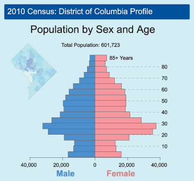
According to dictionary.com, a Population profile is a "a chart showing the number of people as a function of their age." A Population Profile is simply a chart that visually shows the number of people and their specific ages in a given area. The chart or map above features population by sex and age in District of Columbia in 2010.
Source: http://dictionary.reference.com/browse/population+profile
Scatterplot
http://rortybomb.wordpress.com/2011/04/11/housing-lock-is-not-a-major-component-of-this-crisis-plus-scatterplots-of-deleveraging/
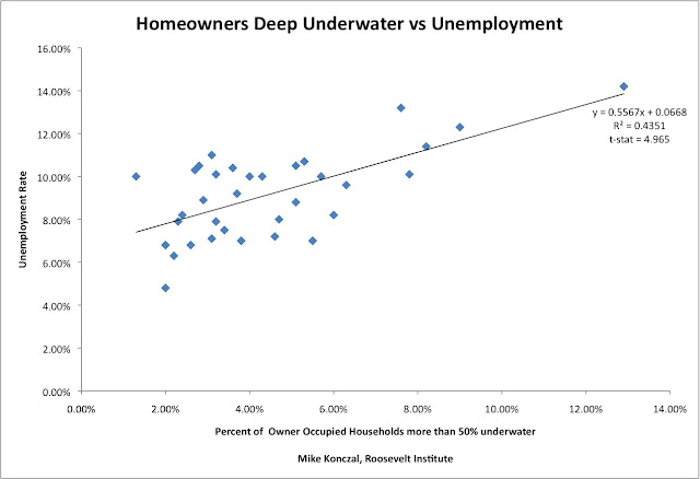
A scatterplot is a way to show a relationship between two variables. The map above represents the relationship between households more than 50% underwater and unemployment rate.
Nominal Area Choropleth Map
http://politicalmaps.org/2008-house-of-representatives-election-maps/
Nominal Area Choropleth Map are maps that shows categorical data rather than numerical data. The elements of a choropleth map are used within these maps to separate the data being shown. The map above shows U.S House winners by district during the 2008 Election.
Accumulative Line Graph / Lorenz Curve
http://www.mathworks.com/matlabcentral/fileexchange/19968
According to Wikipedia, "In economics, the Lorenz curve is a graphical representation of the cumulative distribution function of the empirical probability distribution of wealth; it is a graph showing the proportion of the distribution assumed by the bottom y% of the values. It is often used to represent income distribution, where it shows for the bottom x% of households, what percentage y% of the total income they have." The graph above features the percentage of the population from the poorer to the richer comparing the wealth. The blue line (Lorenz Curve) represents income distribution.
Source Wikipedia & Sullivan, arthur; Steven M. Sheffrin (2003). Economics: Principles in action. Upper Saddle River, New Jersey 07458: Pearson Prentice Hall. pp. 349. ISBN 0-13-063085-3.
Bilateral Graph
http://www.voxeu.org/index.php?q=node/4997
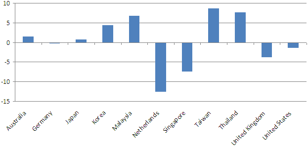
Bilateral Graphs are graphs that so positive and negative values within the data set. The map above shows bilateral trade balances with China (percent of GDP). Some balances are negative, like The United States and others are positive, like Japan.
Univariate Choropleth Maps

http://www.agcensus.usda.gov/Publications/2002/Ag_Atlas_Maps/Crops_and_Plants/index.asp
Univariate Choropleth Maps are simply choropleth maps that show only one data set. In the map above, it features acres of corn harvested in 2002.
Proportional Circle Map
http://www.geog.ucsb.edu/~jeff/gis/proportional_symbols.html
Proportional Circle maps are maps that represent data with the use of different sized circles. The map above is interent users in Europe in 2004. I believe one can conclude that there are a larger number of people who use the interest in Germany. The larger the circle the larger number of whatever is being measured, in this case interent users.
Unclassed Choropleth Maps
http://gis.depaul.edu/shwang/teaching/geo381/LN9.htm
Unclassed Choropeth are maps that use shading of colors to represent proportional data without the use of a legend. The photo above shows both classed (left) and unclassed (right) choropeth maps. It is noticeable that the map on the right doesn't have a legend and consists of more colors (shades of green).
Range Graded Proportional Circle Map
http://www.e-cartouche.ch/content_reg/cartouche/cartdesign/en/html/ThemMaps_ThemData.html
Range graded proportional circle map are very similar to Continuously variable proportional circle map except that these types of maps use a set number of circles and have a range of values for each circle size within the legend. For example, if the number of Irish Catholics were being measured in an area of Boston, MA, there would be a specific number range used within the legend (i.e. 5,000-4,000, 500-400, 50-40, etc). The map above measures the inhabitants of the Communes in Zurich, Switzerland. The legend includes four different sized circles each representing a different number range.
Continuously Variable Proportional Circle Map
http://personal.frostburg.edu/krtopping0/maps.htm
Continuously variable proportional circle map are used to represent data. The circles within the maps represent the proportion of the data being measured. For example, if crime rates within areas were being measured. There would be larger circles in areas with higher crime rates and in areas of lower rates there would be smaller circles. The map above measures the number of people killed in road accidents in Europe in 2000. The legend includes a range a numbers with a specific size orange circle associated with each.
Classed Choropleth Map
http://personal.uncc.edu/lagaro/2101/2101_ProjectsS2001/JonathanKozar.html
Classed choropleth maps involved two types of information within the legend; both of range of colors and a range of numbers of what is being measured. In the map above, it measures Beef Cattle Emission in North Carolina in 1992. The legend includes a range of different shades of red which represent a range of emissions; the darker the shade of red, the more emissions released.
Monday, March 19, 2012
DOQQ (Digital Orthophoto Quarter Quads)
http://www.geology.enr.state.nc.us/doqq.html
Digital Orthophoto Quarter Quads or DOQQa are digital images of aerial photos. It combines both photograph and map characteristics. The image above in a color DOQQ taken above North Carolina. As you can see, this image has both photograph and map characteristics.
Sunday, March 18, 2012
DEM (Digital Elevation Model)
http://en.wikipedia.org/wiki/File:Oregon_DEM_relief_map.gif
According to Wikipedia, DEM or Digital Elevation Model are digital or three dimensional representations of surface. Most DEM are of the earth's surface. The map above is a three dimensional model of the state of Oregon. It features the different areas of elevation throughout the whole state by using color and shading.
DLG (Digital Line Graph)
http://weather.unisys.com/usgs/3sec/index.php
According to the U.S Department of Interior and the U.S Geological Survey Fact Sheet, "Digital line graph (DLG) data are digital representations of cartographic information. DLG’s of map features are digital vectors converted from maps and related sources. The U.S. Geological Survey (USGS) DLG data are classified as large, intermediate, and small scale." The map above features digital elevations of the United States, which each color representing difference elevation levels.
Source: http://egsc.usgs.gov/isb/pubs/factsheets/fs07896t.pdf
DRG (Digital Raster Graphic)
http://www.tceq.texas.gov/gis/drg.html
According to Wikipedia, "A digital raster graphic (DRG) is a digital image resulting from scanning a paper USGS topographic map for use on a computer. DRGs created by USGS are typically scanned at 250 dpi and saved as a TIFF. The raster image usually includes the original border information, referred to as the "map collar". The map file is UTM projected and georeferenced to the surface of the earth. DRG's are regularly used in GIS applications." From the definition, a DRG is simply a paper map that is created into a digital image. More can be done with an image on a computer. In the map above, it features Walter Beach and the surrounding area of Austin, TX. This map is a digital image from a topographic map.
Black & White Aerial Photo
http://freegeographytools.com/2007/georeferenced-terraserver-imagery-with-usaphotomaps
Black and white aerial photography is photos taken from satellites, balloons, aircraft, etc. Black and white aerial photos have been used since the techonology first existed. It was used by the military to look at enermies from long range distances. The photo above is simply an aerial image taken of Tuscon, AZ.
Bivariate Choropleth Map
http://www.personal.psu.edu/faculty/c/a/cab38/GEOG321/14_multivariate02/multivariate.html
Bivariate choropleth are maps that display two variable on a single map. Those variable may be identified by different colors or symbols. In the map above, the two variable shown are population density in 1990 and population change from 1990 to 2000.
Isopach
http://seeps.geol.ucsb.edu/pages/isopach.html
According to the Merrian-Webster online dictionary, Isopach is “an isoline that connects points of equal thickness of a geological stratum formation or group of formations.” The map above is an Isopach map featuring the coast of Santa Barbara, CA. The different colors represent the amounts of sediment on the ocean floor, pink represents the greatest thickness.
Isohyet
http://www.scoop.co.nz/stories/AK0808/S00090.htm
According to the Merrian-Webster online dictionary, Isohyet is “a line on a map or chart connecting areas of equal rainfall.” The map above features the
Isotach
http://wxmaps.org/pix/euro.jet.html
According to the Merrian-Webster online dictionary, Isotach are “lines on a map or chart connecting points of equal wind speed.” This map features many different isotachs. The purple shading indicates a wind speed of 200 millibars m/s. The streamlines indicate direction of the wind. The other colors are other speeds of the wind.
Saturday, March 17, 2012
Isobar
http://stormeyes.org/pietrycha/vortex/floyd/floydtornadoes.html
According to dictionary.com, Isobars are “a line drawn on a weather map or chart that connects points at which the barometric pressure is the same.” The map above features Isobars from Hurricane Floyd from 1999. The solid lines represent the Isobars which are measured in millibars.
LIDAR
http://cintos.org/LiDAR_images/index.html
LIDAR or Light, Detection and Ranging is a type of remote sensing in which it measures distance to a object using light. The map above is of Rex, NC. According to the website, the map "
Doppler Radar
http://www.noaanews.noaa.gov/stories2004/s2311.htm
Doppler radar is radar that uses the Doppler effect to produce data about distance objects. According to the Merrian-Webster online dictionary, The Doppler effect is “a change in the frequency with which waves (as of sound or light) from a given source reach an observer when the source and the observer are in motion with respect to each other so that the frequency increases or decreases according to the speed at which the distance is decreasing or increasing.” One major use of the Doppler radar is in Meteorology. The map above features Hurricane Francis hitting the east coast of Florida.
Infrared Aerial Photo
http://www.cedareden.com/massena/gis.html
Infrared aerial photo is photography taken of the ground from a distance object in the air, such as a satellite, aircraft, rocket, balloon, etc. This photo was taken of
Cartographic Animations
http://www.viewsoftheworld.net/?p=1199
Cartographic animations involve the aspects of cartograms with the use of different elements, such as lines and dots to represent data. The difference from regular cartograms is the use of animation. The cartogram above features population of London. The map features animation in which with each year change, the map's colors change in reference to the migration of the population from 2001-2031.
Statistical Map
http://seattlebubble.com/blog/2006/09/11/mapping-housing-market-health/
According to McGraw-Hill Science & Technology Dictionary: via answers.com a Statistical map is “A special type of map in which the variation in quantity of a factor such as rainfall, population, or crops in a geographic area is indicated; a dot map is one type. In the map above, it features new and refinanced mortgages into loans with different payment options. The darker the color, the higher the averages.
Cartogram
http://www.dailymail.co.uk/news/article-439315/How-world-really-shapes-up.html
Cartograms are simplified data condensed into a visual representation on a map. These maps use lines, dots, and other symbols to represent different types of data. In the map above, it features the wealth of nations in 2002. The size of each country is a reflection of its wealth; the more wealthier countries are larger.
Flow
http://www.mekongmigration.org/?page_id=25
Flow maps are a type of map used to layout sequences, like directions or ordering of thoughts. They can also be used to show the movement or “flow” of things. In the flow map, it features the migration into and out of southeast Asia.
Isoline
http://mapmaker.rutgers.edu/355/links.html
Isoline maps are used to show three-dimensional models as two-dimensional. Isoline maps are used to show a number of different things, some of which include difference in temperature on weather maps as well as populations of people around the world. The map above features what Isolines look like on a map and how they're read.
Dot Distribution
http://udel.edu/~patronea/frec480/proj1/
Dot distribution maps are maps in which dots are used to represent spatial patterns. For example, a map could represent the population density of the United States using dots. Larger dots or a more distribution of dots would represent larger populations in certain areas of the United States. The map above features, the United States population in 2000. Each dot represents 10,000 people.
Subscribe to:
Comments (Atom)


